
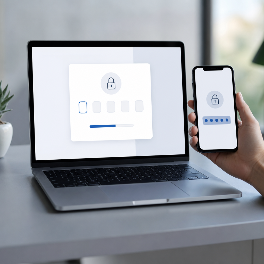
Multi factor authentication protects accounts by requiring more than one proof of identity. However, weak interface design can make authentication frustrating and insecure. Clear font size choices and a focused page shell help users complete security steps confidently. Better design reduces errors, support requests, and abandoned sign-in attempts.
Organizations should treat multi factor authentication as both a security control and a user experience. NIST digital identity guidance supports usable, risk-aware authentication practices. When people understand each screen, they are less likely to approve fraudulent prompts.
Why Multi Factor Authentication Design Matters
Multi factor authentication adds important protection against stolen passwords. It may combine a password with an authenticator app, security key, biometric scan, or temporary code. Yet users cannot benefit from these protections when screens are difficult to read.
Poor layouts can cause users to enter codes incorrectly. Small text can hide essential instructions. Confusing page transitions can make a legitimate sign-in appear suspicious. These problems often lead employees to seek unsafe shortcuts.
A strong design supports faster decisions without reducing security. It should explain what users need to do next. It should also show why the request matters.
For broader protection planning, review why businesses need multifactor authentication and cloud backups for data security. Authentication works best alongside resilient recovery controls.
Key usability benefits include:
- Fewer failed sign-in attempts
- Lower help desk demand
- Faster employee access
- Greater trust in security prompts
- Reduced approval of phishing requests
- Better accessibility for every user
Choose a Readable Font Size for Authentication Screens
Font size directly affects whether users can complete authentication correctly. Code entry screens often include time-sensitive instructions. Users should not need to zoom in or guess what each field means.
A practical baseline uses body text that remains legible on desktop and mobile devices. Important instructions deserve stronger visual prominence. Avoid compressing all content to fit a single screen.
The Web Content Accessibility Guidelines provide useful standards for readable, accessible interfaces. They emphasize adaptable text and sufficient contrast.
Use font size hierarchy with clear intent:
- Use larger headings for the current authentication step.
- Keep body instructions easy to scan.
- Make code entry labels prominent.
- Use readable button text with direct actions.
- Avoid tiny secondary links near critical controls.
- Allow text resizing without breaking the layout.
A 16-pixel base font size often works well for standard body content. Larger text may be necessary for mobile authentication flows. Code fields should remain easy to distinguish, especially under poor lighting.
Do not rely on font size alone to communicate urgency. Pair important notices with plain language and visible placement. For example, state, “Enter the six-digit code from your authenticator app.”
Build a Page Shell That Keeps Users Focused
The page shell is the surrounding structure that frames the authentication experience. It includes navigation, headers, footers, content width, and supporting elements. A cluttered page shell distracts users during a security-sensitive task.
Authentication screens should remove unnecessary choices. Users need a simple path from identity confirmation to successful account access. Extra menus, promotional banners, and dense sidebars can create hesitation.
A focused page shell improves comprehension by limiting visual competition. It also makes fraudulent pages easier to recognize. Consistent branding, spacing, and navigation help employees identify authentic sign-in environments.
Learn more about content width and interface clarity in how max-width design makes workplace technology easier to use.
An effective page shell should include:
- A recognizable company logo
- A short, descriptive page title
- A centered authentication panel
- Clear spacing around form fields
- Limited navigation during sign-in
- Visible support options for legitimate problems
- Consistent branding across every authentication step
Keep the main panel narrow enough for comfortable reading. Wide forms make users scan across the screen unnecessarily. A controlled maximum width also improves mobile responsiveness.
Design Each Authentication Step for Clarity
Multi factor authentication should feel like a guided sequence. Each page should present one primary action. Users should never wonder whether they completed a step successfully.
Start by identifying the requested action. Tell users whether they need to enter a code, approve a push, or use a security key. Avoid vague wording such as “Verify” without added context.
Helpful microcopy can prevent confusion. Explain where the code comes from and what happens after submission. Mention time limits when they exist, but avoid creating needless panic.
Use these design principles for each step:
- State the current step in the heading.
- Explain the required action in one sentence.
- Label every field clearly.
- Show errors near the affected field.
- Preserve entered information when possible.
- Confirm successful authentication immediately.
- Offer a safe fallback method when needed.
For example, a push notification page should say, “Open your authenticator app and approve this sign-in request.” It should also show the location or device details when available.
This context helps users detect unexpected requests. It also supports stronger defenses against approval fatigue attacks. CISA guidance on multi-factor authentication explains why phishing-resistant methods matter.
Use Layout to Prevent Authentication Errors
Page layout determines where users look first. Good visual order reduces rushed clicks and incorrect code submissions. Place the essential action near the center of the user journey.
Start with a descriptive heading. Follow it with a short explanation and the relevant input or approval control. Put secondary options below the primary button.
Avoid placing destructive actions beside approval buttons. A user should not accidentally cancel a recovery process or sign out. Separate sensitive choices with space and clear labels.
Consider these layout practices:
- Place instructions directly above code fields.
- Use one-column forms for short authentication tasks.
- Keep primary buttons visually distinct.
- Leave enough space between interactive elements.
- Display error messages near their cause.
- Avoid automatic focus changes that confuse keyboard users.
- Keep recovery links visible but secondary.
Mobile design deserves special attention. Many employees approve prompts or receive codes on phones. Buttons need enough space for accurate tapping. Inputs should not trigger awkward zoom behavior.
Responsive layouts also protect productivity. Employees should complete authentication while traveling, working remotely, or switching devices. Reliable tech support for growing businesses in New Philadelphia can help organizations align usability with ongoing security needs.
Support Accessible and Secure Authentication Experiences
Accessible authentication serves employees, customers, and partners with different abilities. It also improves usability for everyone. Clear text, predictable navigation, and visible labels reduce cognitive effort.
Do not depend only on color to show errors or success. Pair colors with written messages and recognizable icons. Ensure that contrast remains strong across buttons, fields, and help text.
Keyboard navigation is essential. Users should move through fields in a logical order. Focus indicators must remain visible at every stage.
Accessibility priorities include:
- High contrast between text and backgrounds
- Resizable text without clipped content
- Visible keyboard focus states
- Labels connected to all form controls
- Clear error descriptions
- Alternatives to app-only authentication methods
- Recovery processes that respect user privacy
Authentication should also avoid exposing unnecessary personal details. Mask phone numbers and email addresses when presenting recovery options. Reveal only enough information for users to identify the correct method.
Security awareness reinforces good interface design. Employees who recognize suspicious prompts make safer decisions. How smarter phishing protection keeps your business running at full speed explains how phishing defenses support business continuity.
Test Multi Factor Authentication Before Deployment
Even polished mockups can fail in real-world conditions. Test multi factor authentication with people using different devices, browsers, and accessibility tools. Include remote workers and less technical employees.
Measure task completion, error rates, and time spent on each step. Watch for hesitation around instructions, recovery options, and approval prompts. Small findings can produce major improvements.
Test these scenarios before launch:
- First-time enrollment
- Routine sign-in from a known device
- Sign-in from a new location
- Lost phone recovery
- Expired code entry
- Push notification denial
- Security key authentication
- Keyboard-only navigation
- Screen reader navigation
Collect user feedback after deployment as well. Authentication flows can change when vendors update applications or browser behavior. Regular reviews keep the page shell and font size choices effective.
Security teams should track suspicious approval patterns. Repeated denied prompts may indicate an attempted attack. Support teams should also report common user pain points.
Final Thoughts
Better multi factor authentication design protects users without slowing their work. Readable font size choices, focused page shell layouts, and direct instructions create safer sign-in experiences. Treat authentication as a complete user journey, then test it continually for clarity, accessibility, and security.